The purpose of this project is to see the effects of setting text justified (flush left and flush right); how allowing hyphenation changes the appearance of the text; how adjusting line length affects word spacing and readability; and how altering the H&J settings can be used to further adjust word spacing.
Gutenberg set his 42-line Bible using two columns of justified text, and the evenness of the typesetting was partly the result of using abbreviations and characters of varying widths. Today, we usually use hyphenation (breaking of words) when setting justified text, so that unsightly gaps between words are minimized.
When you set text justified, the spaces between words will be uniform on any particular line, but will differ from line to line. QuarkXPress allows the word spaces to range from a minimum to a maximum value (the left and right numbers in the H&J specification), with an optimal value (the middle number) as an ideal.
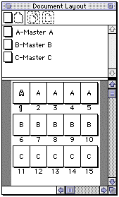
Your document will have at least 15 pages, arranged like this:

The first set of pages will show the material justified but with hyphenation turned off. Each page will use a different line length.
The second set of pages will show the material justified and with hyphenation turned on. The line lengths will match the first set of pages.
The third set of pages will choose one line length that is most appropriate, and show the material justified, with hyphenation turned on, and with various H&J values to change the word spacing.
Build a US Letter size document in vertical orientation.
Edit the Normal style:
In order to set the H&J setting, you should append five H&J settings I have already created, or build your own according to the information listed on the web page about word spacing in QuarkXPress, where I refer to settings with names h1, h2, h3, h4, and h5.
A quick way to get the text onto five pages is to put it on Master Page A. Build a text block. Import the text from 04-thoreau.txt. Adjust the dimensions of the text block so you can see the entire text.
Add a separate text block on the page with the following information set in 8/12 Humanist 777.
Typography: Your Name
Font: 00/00 Fontname x 00 pi
H&J: u3 (no hyphens, word space 80-100-133%)
Page: <#>
Use the Command-3 feature to get the automatic page number in the bottom.
Make at least 5 pages based on Master Page A. You can drag the icon for Master Page A into the Document Layout palette to build these five pages.
Edit each page so that the text block width is different. Sample widths might be 14 pi, 17 pi, 20 pi, 23 pi, 26pi. Having a very narrow and a very wide one will be most instructive. Update the information lines on each page to indicate the correct text block width.
Instead of choosing specific pica widths for the text block, you may use 1, 1.5, 2, 2.5, and 3 lowercase alphabets to guide you in sizing the text blocks.
26 chars = abcdefghijklmnopqrstuvwxyz
39 chars = abcdefghijklmnopqrstuvwxyzabcdefghijklmn
52 chars = abcdefghijklmnopqrstuvwxyzabcdefghijklmnopqrstuvwxyz
65 chars = abcdefghijklmnopqrstuvwxyzabcdefghijklmnopqrstuvwxyzabcdefghijklm
78 chars = abcdefghijklmnopqrstuvwxyzabcdefghijklmnopqrstuvwxyzabcdefghijklmnopqrstuvwxyz
Copy and paste the text blocks from pages 1-5 onto pages 6-10. Select the text and use the Format option to change the H&J setting for the text to a normal setting that allows hyphenation.
Edit the H&J information at the bottom of the master page to indicate the new setting:
H&J: h3 (hyphens, word space 80-100-133%)
This indicates that word spaces in this setting can vary from 80% of their usual size to as large as 133% of their usual size.
The column widths should match pages 1-5 but all of them will use the h3 H&J setting.
For the last five pages, change the size of the text boxes to whatever width you think looks best among the ones you saw in pages 1-10, or a width that is between two you liked. The goal is to find a comfortable book-design line length.
Edit each page so that only the H&J settings vary: h1, h2, h3, h4, and h5. Also edit the information at the bottom of each page, including the range of min.-opt.-max. word spacing associated with each H&J.
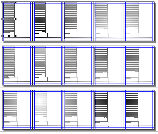
When you're done, your document will look something like this (shown at 10% size):

Save your work using lastname-4a.qxd.
Use what you have learned about line length and justified text to design a book page that will work well with the Thoreau text.
Bringhurst. Elements of Typographic Style.
Chapter 4: Structural Forms & Devices
Clair, Kate. A Typographic Workbook.
Readability & Legibility (pp. 170-174)
Gill, Eric. An Essay on Typography.
Chapter 6: The Procrustean Bed (pp. 88-94)